Tattoo Patterns Letters: Complete Design Guide 2026
Lettering tattoos remain one of the most personal and meaningful forms of body art, transforming words, names, dates, and phrases into permanent visual statements. Choosing the right tattoo patterns letters requires careful consideration of typography, aesthetics, placement, and long-term wearability. Whether you're commemorating a loved one, expressing personal values, or celebrating cultural heritage, understanding the nuances of letter-based tattoo designs ensures your ink remains both legible and beautiful for decades to come.
Understanding Typography Fundamentals for Tattoo Art
Typography in tattoo design follows different principles than print or digital design. The human body provides a living, three-dimensional canvas that moves, ages, and changes over time. Fine line lettering demands exceptional precision, particularly when working with smaller text sizes or intricate decorative elements.
The foundation of successful tattoo patterns letters begins with understanding type classifications. Serif fonts feature decorative strokes at the ends of letterforms, providing a classical, traditional appearance. Sans-serif styles offer clean, modern aesthetics with straightforward letterforms. Script and cursive variations deliver elegance and fluidity, while gothic and blackletter typefaces communicate strength and historical gravitas.
Body Placement Considerations for Letter Tattoos
Different body locations present unique challenges and opportunities for lettering designs:
Ribs and torso: Accommodate longer phrases with natural horizontal flow
Forearms: Ideal for medium-length text with high visibility
Spine: Perfect for vertical arrangements and centered compositions
Fingers and hands: Require bold, simple letterforms for clarity
Collar bones: Suit delicate script and shorter meaningful words
When choosing the right tattoo studio for lettering work, ensure the artists demonstrate portfolio examples with crisp, consistent letterforms across various styles.
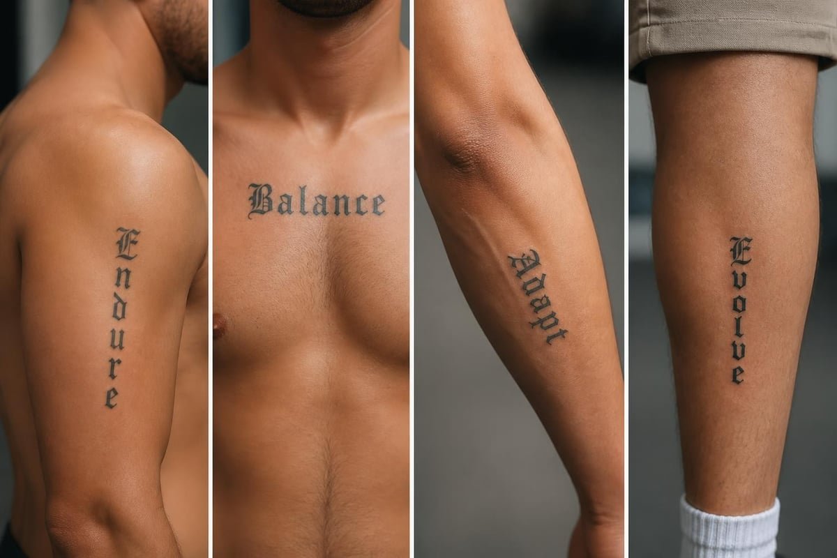
Letter tattoo placement zones
Popular Letter Pattern Styles and Their Applications
The world of tattoo patterns letters encompasses dozens of distinctive styles, each carrying specific cultural associations and visual characteristics. Understanding these categories helps you select typography that authentically represents your message and personal aesthetic.
Classic and Traditional Lettering Approaches
Traditional American tattoo lettering typically features bold, blocky characters with strong outlines and high contrast. These designs prioritize readability from a distance and maintain clarity as the tattoo ages. Sailor Jerry-inspired lettering remains popular for nautical themes, military tributes, and vintage aesthetics.
Old English and gothic letterforms deliver dramatic impact with their ornate, angular structures. These patterns work particularly well for single words, initials, or short phrases where each letter receives adequate space. The complexity of gothic lettering requires substantial skill to execute properly.
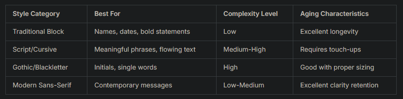
Contemporary and Minimalist Typography
Modern tattoo patterns letters increasingly embrace minimalist design principles. Fine line lettering creates delicate, sophisticated text that appeals to clients seeking understated elegance. This approach demands exceptional technical skill, as any inconsistency in line weight or spacing becomes immediately apparent.
Geometric and architectural letterforms incorporate precise angles, mathematical proportions, and structural elements. These designs often complement abstract or technical imagery, appealing to those drawn to contemporary art and design movements.
According to typography experts who distinguish quality hand-lettering, authentic craftsmanship reveals itself through consistent stroke weight, proper counter spacing, and thoughtful kerning throughout the composition.
Design Considerations for Long-Term Quality
Successful tattoo patterns letters maintain their integrity and readability across decades. Several critical factors influence how lettering tattoos age and whether they retain their intended appearance.
Size matters significantly in letter-based designs. Text smaller than 8-10mm in height risks becoming illegible within 5-10 years as the ink naturally spreads beneath the skin. Artists recommend sizing up rather than cramming text into insufficient space.
Color Selection and Contrast
Black ink remains the gold standard for lettering tattoos due to its superior longevity and contrast against all skin tones. The pigment maintains sharp definition and resists fading more effectively than colored alternatives. While choosing colors that complement your skin tone can enhance certain tattoo styles, lettering generally benefits from maximum contrast.
Clients occasionally request white ink or light gray lettering for subtle effects. These approaches work best on darker skin tones and require realistic expectations about visibility and maintenance. White ink typically appears cream or beige on most skin and fades faster than traditional black.
Black ink: Maximum contrast and longevity
Dark gray: Softer appearance while maintaining readability
Brown tones: Warm aesthetic for script styles
White/light gray: Subtle effects requiring more maintenance
Color lettering: Higher maintenance, faster fading
Technical Execution and Artist Skill
The technical quality of tattoo patterns letters depends heavily on the artist's typography expertise and steady hand. Consistent baseline alignment ensures letters sit evenly rather than appearing to drift or dance irregularly. Uniform stroke weight throughout creates professional polish rather than amateurish variation.
Proper spacing (kerning) between letters prevents awkward gaps or cramped clustering. Professional tattoo artists adjust spacing based on letter combinations, creating optical balance rather than merely mechanical measurement. Understanding when to choose bespoke lettering versus standard fonts separates exceptional work from mediocre results.
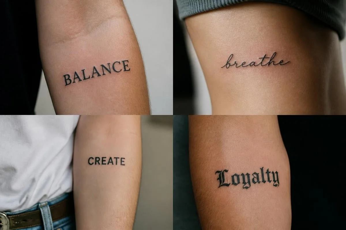
Typography technical elements
Cultural and Linguistic Typography Variations
Letter tattoos transcend English language boundaries, incorporating diverse writing systems and cultural traditions. Each linguistic tradition brings unique aesthetic characteristics and cultural significance to body art.
Asian Language Lettering Systems
Chinese characters and Japanese kanji offer compact, meaningful designs that communicate complex concepts within single glyphs. These logographic systems appeal to both native speakers and those drawn to Eastern philosophy and aesthetics. However, accuracy remains paramount, as incorrect characters or poor stroke order can completely alter intended meanings.
Chinese tattoo designs require artists familiar with proper brush stroke techniques and traditional calligraphic principles. The orientation, balance, and structural composition of characters follow specific rules that differ fundamentally from alphabetic systems.
Thai script represents another popular choice, particularly in Bangkok where traditional Thai tattoos carry deep cultural significance. The flowing, circular characteristics of Thai letters create graceful compositions suited to both sacred Sak Yant designs and contemporary lettering work.
Arabic, Hebrew, and Sanskrit Calligraphy
Arabic calligraphy transforms text into flowing, artistic compositions where letterforms connect and interact dynamically. Multiple calligraphic styles (Thuluth, Naskh, Diwani) offer varying degrees of ornamentation and formality. Right-to-left directionality requires careful planning during placement.
Hebrew lettering carries spiritual significance for many wearers, with specific fonts like Ktav Ashuri conveying traditional religious associations. Sanskrit, the classical language of Hindu and Buddhist texts, appears frequently in spiritual and yogic tattoo designs, with Devanagari script providing distinctive visual character.
Combining Letters with Decorative Elements
Many clients enhance pure typography with complementary decorative elements that add depth, context, or personal symbolism to their tattoo patterns letters.
Ornamental flourishes integrate flowing lines, botanical elements, or geometric patterns around letterforms. These additions frame text, fill negative space, or create balanced compositions across irregular body contours. Victoriana-inspired designs combine script lettering with roses, filigree, and ribbon banners for romantic aesthetics.
Integration with Symbolic Imagery
Letters often anchor larger compositions that incorporate meaningful imagery:
Portrait integration: Names or dates accompany realistic portraits of loved ones
Memorial designs: Dates of birth and death frame symbolic imagery like flowers or doves
Cultural symbols: Text pairs with traditional imagery reflecting heritage
Geometric frameworks: Letters nest within mandalas, sacred geometry, or architectural elements
Natural elements: Botanical illustrations, animals, or landscapes contextualize meaningful phrases
Understanding symbolism behind different design elements helps create cohesive compositions where typography and imagery reinforce unified themes.
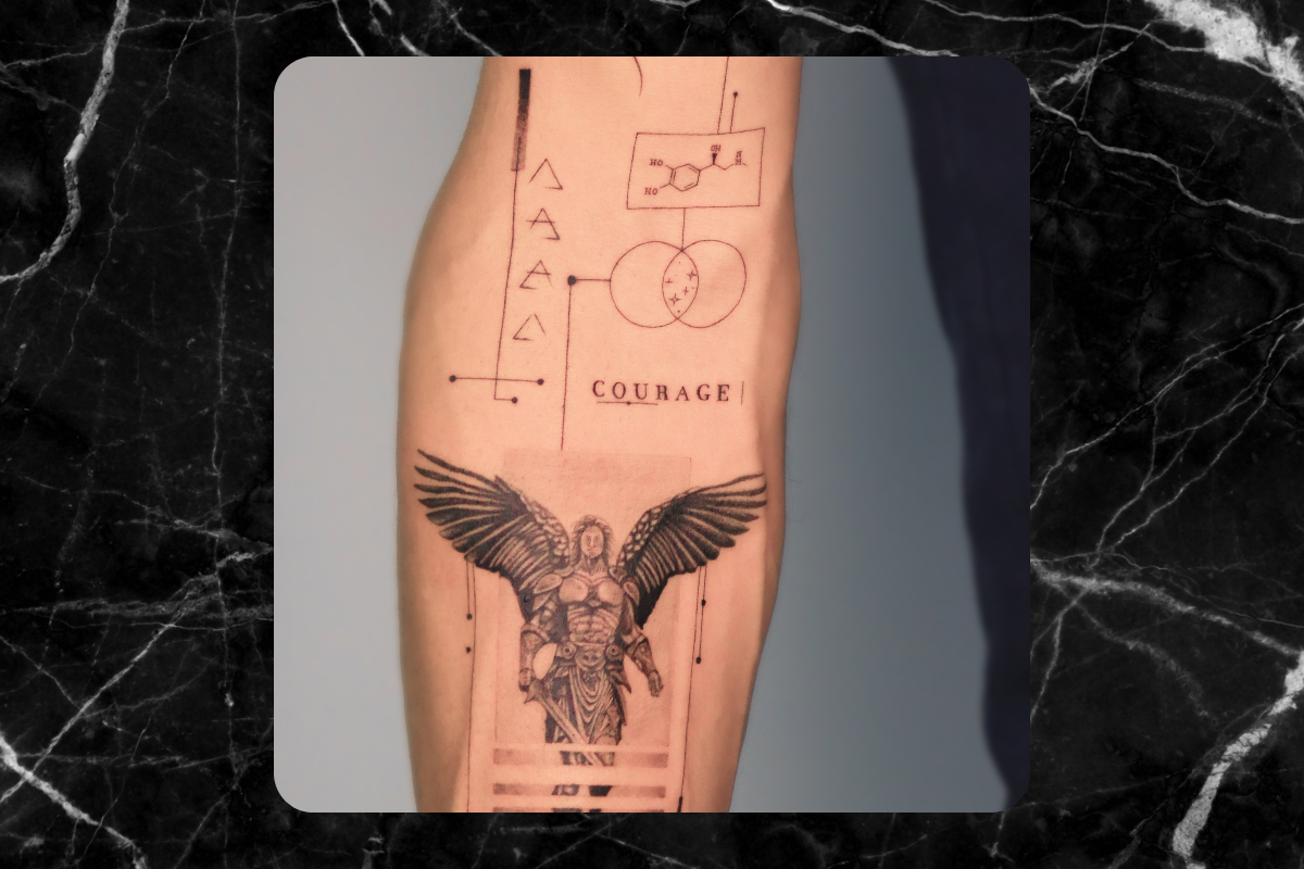
Text and image integration
Preparing for Your Lettering Tattoo Session
Proper preparation ensures optimal results when getting tattoo patterns letters. The consultation process allows you to communicate your vision while benefiting from professional guidance regarding technical feasibility and aesthetic refinement.
Selecting and Refining Your Text
Choose words, phrases, or quotes that maintain personal significance across time. Consider avoiding trendy expressions, inside jokes that may lose meaning, or relationship-specific text that could become regrettable. Names of children, deceased loved ones, and enduring philosophical principles typically withstand life changes better than romantic partners' names or temporary enthusiasms.
Verify spelling and translation accuracy multiple times before your session. Have native speakers confirm foreign language text. Research quotes to ensure proper attribution and complete phrases. Even professional tattoo artists cannot catch errors in languages they don't speak.
Understanding the Session Process
When knowing what to expect during your first tattoo session, recognize that lettering work demands meticulous concentration from your artist. The steady hand control required for consistent letterforms means fewer breaks and intense focus throughout application.
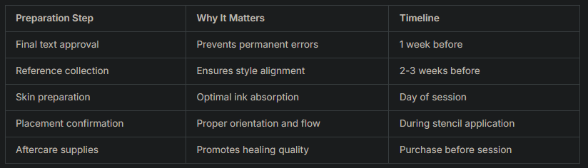
Session duration varies based on text length, complexity, and decorative elements. Simple name tattoos may require 30-60 minutes, while elaborate multi-line compositions with ornamental details can extend to several hours.
Specialty Lettering Techniques and Innovations
Contemporary tattoo patterns letters continue evolving through innovative techniques and artistic experimentation. Artists push boundaries while respecting fundamental principles of readability and longevity.
Negative Space and Inverse Lettering
Negative space lettering creates letterforms by tattooing around characters rather than filling them directly. This approach produces distinctive visual effects where letters appear as skin-toned gaps within solid black backgrounds. The technique works particularly well for bold, simple fonts where letter recognition remains clear.
Inverse or outlined lettering uses only the contours of letterforms, leaving interiors empty. This lightweight approach suits minimalist aesthetics and reduces overall tattoo density. However, very thin outlines risk becoming indistinct as the tattoo ages.
Three-Dimensional and Shadow Effects
Dimensional lettering incorporates shading, highlighting, and perspective to create the illusion of depth. Drop shadows suggest letters floating above the skin, while gradient fills add volume and substance. These techniques significantly increase complexity and session time but deliver dramatic visual impact.
Carved or chiseled effects make letters appear etched into stone, creating memorial or classical aesthetics. The artist uses strategic shading to suggest depth, texture, and light source direction.
Maintenance and Touch-Up Considerations
Even expertly executed tattoo patterns letters require ongoing care and occasional maintenance to preserve their appearance. Understanding aging patterns helps set realistic expectations and plan for long-term stewardship of your body art.
Natural Aging and Ink Spreading
All tattoos experience some degree of ink spread (blurring) as pigment particles gradually disperse beneath the skin. Fine lines and tight spacing between letters show this effect more noticeably than bold, well-spaced designs. Factors influencing aging include:
Sun exposure and UV damage
Skin type and natural aging processes
Original ink depth and saturation
Letter size and spacing decisions
Body location and skin movement
Protecting tattoos with UV protection strategies significantly slows fading and maintains contrast. Daily sunscreen application on exposed tattoos proves essential for long-term preservation.
When to Consider Touch-Ups
Most quality lettering tattoos maintain acceptable appearance for 10-15 years before requiring touch-ups. Signs that refresh work may help include faded contrast, blurred letterforms, or loss of fine detail in decorative elements.
Touch-up sessions allow artists to re-establish crisp edges, darken faded areas, and restore overall definition. When caring for your tattoo properly from initial healing through decades of wear, you extend the time between necessary maintenance sessions.
Avoiding Common Lettering Tattoo Mistakes
Learning from others' experiences helps you sidestep predictable pitfalls when planning tattoo patterns letters. Certain errors appear repeatedly, despite being entirely preventable with proper research and professional guidance.
Inappropriate font size represents the most common mistake. Cramming lengthy text into small spaces guarantees illegibility within years. Professional artists recommend minimum letter heights and honest assessments of how much text fits comfortably in your desired location.
Foreign language errors cause lasting regret when incorrect translations, improper grammar, or culturally inappropriate text becomes permanent. Always verify content with multiple native speakers and cultural experts, never relying solely on online translation tools or single sources.
Poor placement choices ignore natural body contours, movement patterns, and professional visibility concerns. Text placed perpendicular to natural body lines appears awkward, while upside-down orientation (readable to the wearer but inverted to observers) creates presentation challenges.
Typography and Readability Errors
Overly ornate fonts sacrifice legibility for decoration. When intricate flourishes and extreme stylization make letters difficult to distinguish, the core purpose of text-communication-fails. Balance aesthetic preference with functional readability by testing fonts at actual size before committing to complex scripts.
Inconsistent styling within single compositions creates visual discord. Mixing multiple fonts, varying letter spacing approaches, or changing stylistic conventions mid-phrase produces amateurish results. Unified design principles throughout ensure professional polish.